Routine Feature Rows Section
The Routine Feature Rows section allows you to display multiple image-and-text rows that highlight how your products fit into different lifestyles, routines, or use cases. This section is ideal for storytelling, product education, or promotional content.
1. Routine Feature Rows � Section Settings
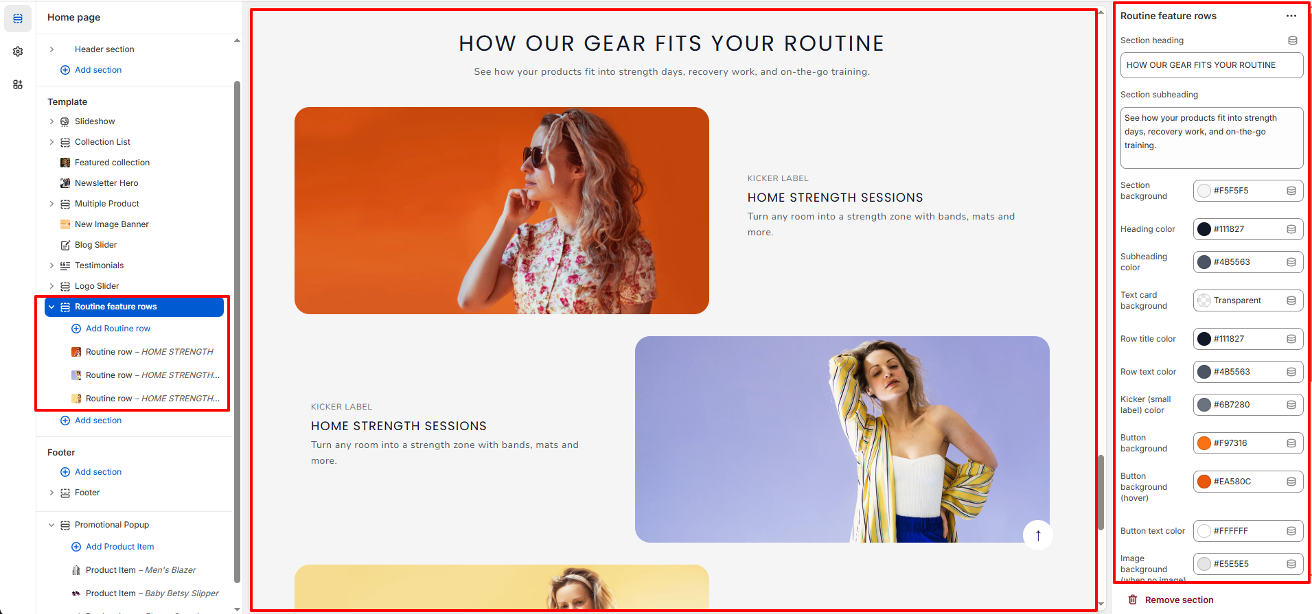
These settings control the overall appearance and styling of the entire section.
Content Settings
- Section Heading: Add the main title displayed at the top of the section.
- Section Subheading: Add supporting text displayed below the heading.
Color & Style Settings
- Section Background: Choose the background color of the entire section.
- Heading Color: Set the color of the main section heading.
- Subheading Color: Set the color of the section subheading text.
- Text Card Background: Select the background style for text content areas (e.g., Transparent or solid color).
- Row Title Color: Control the color of each row�s main title.
- Row Text Color: Set the color for the row description text.
- Kicker (Small Label) Color: Choose the color for the small label text above the row title.
- Button Background: Set the background color of row buttons.
- Button Background (Hover): Set the button background color on hover.
- Button Text Color: Control the color of the button label text.
- Image Background (When No Image): Set a fallback background color when no image is uploaded.
- Placeholder Main Color: Define the primary placeholder color.
- Placeholder Accent Color: Define the secondary accent color for placeholders.
Spacing Settings
- Padding Top (Desktop): Adjust the top spacing for desktop view.
- Padding Bottom (Desktop): Adjust the bottom spacing for desktop view.
- Padding Top (Mobile): Control top spacing for mobile devices.
- Padding Bottom (Mobile): Control bottom spacing for mobile devices.
2. Routine Feature Rows � Block Settings
Each block represents a single feature row consisting of an image and content area. You can add multiple rows and customize them individually.
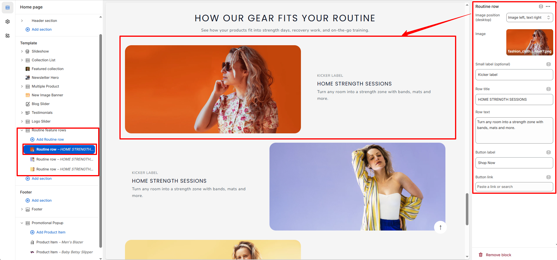
Image Settings
- Row Image: Upload the main image displayed in the feature row.
-
Position:
Choose the position of image and content.
- Image left,Text Right: It make Image on left and content in right
- Image Right,Text Left: It make Image on Right and content in left
Row Content Settings
- Small label: Add a small label displayed above the row title (e.g., Training, Recovery, Lifestyle).
- Row Title: Enter the main heading for the feature row.
- Row Text: Add descriptive text explaining the feature or use case.
- Button Label: Customize the call-to-action button text.
- Button Link: Add a URL to redirect users when the button is clicked.