Collection Page
The Emoll Collection Page allows you to display grouped products with advanced filtering, sorting, and customizable product grid settings. It provides a structured and user-friendly browsing experience, helping customers easily discover products within a specific category.
1. How to Access Collection Page Settings
- Log in to your Shopify Admin Dashboard.
- Go to Online Store >> Themes.
- Click Customize on your active theme.
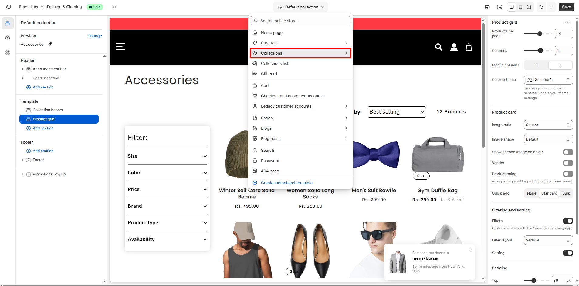
- From the top dropdown, select Collections >> Default collection.
- Click on the Collection banner or Product grid section.
2. Collection Page Overview
The Collection Page displays products that belong to a specific collection (e.g., Accessories). It includes the collection title, optional description, filtering sidebar, sorting dropdown, product count, and customizable product grid layout.
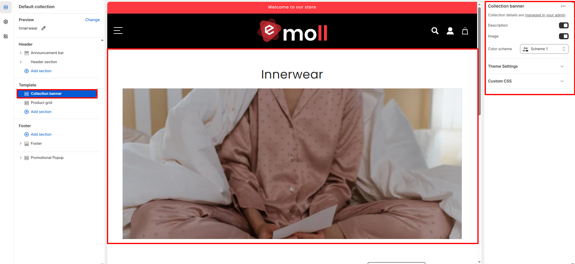
3. Collection Banner Settings
The Collection Banner section appears at the top of the page and displays collection-specific information.
- Show Collection Image: Displays the featured image assigned to the collection.
- Show Collection Description: Displays the description added in the Shopify collection settings.
- Color Scheme: Select a color scheme that matches your store branding.
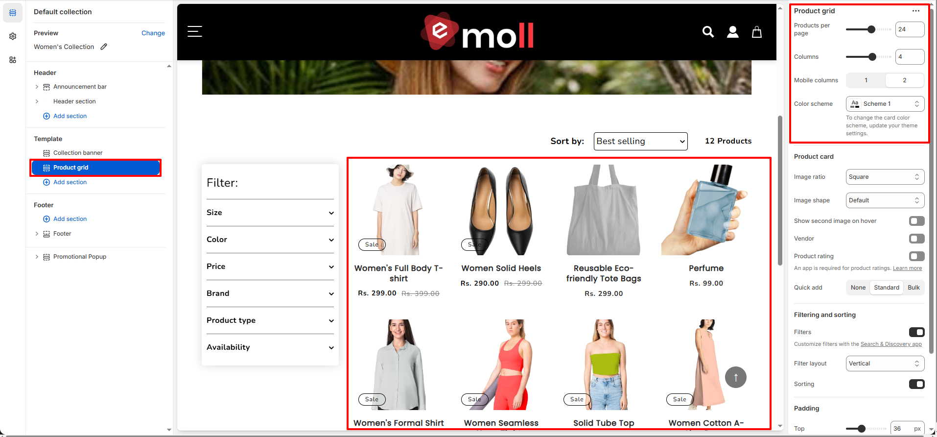
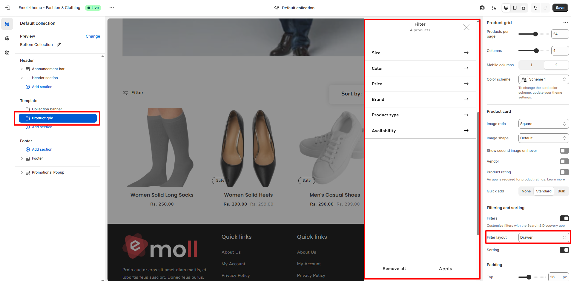
4. Product Grid Settings
The Product Grid section controls how products are displayed within the collection.
- Products per Page: Control how many products are displayed on each page.
- Columns (Desktop): Select the number of product columns displayed on desktop devices.
- Mobile Columns: Choose how many products appear per row on mobile devices.
- Color Scheme: Apply a color scheme to the product grid section.
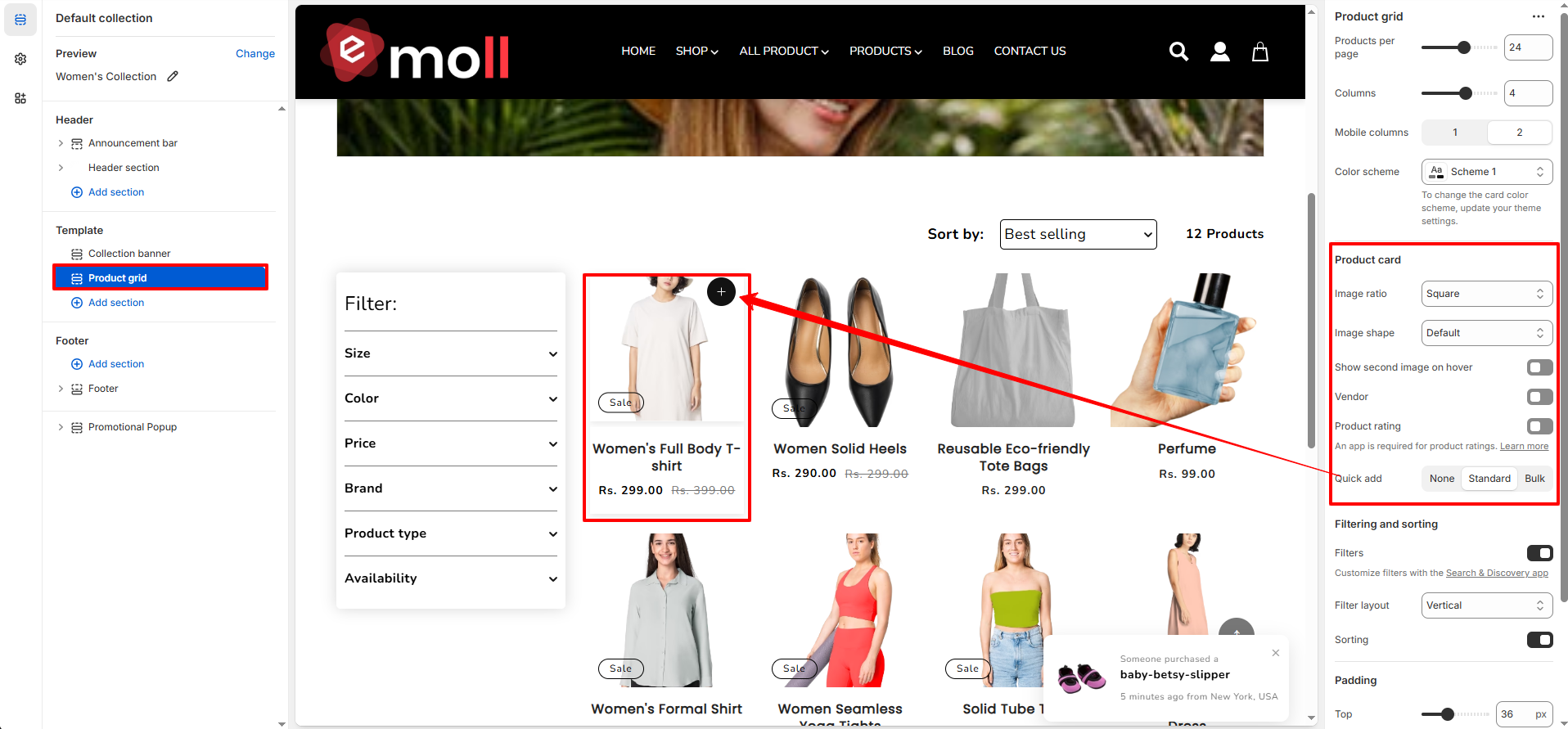
5. Product Card Settings
Customize how each product card appears inside the collection grid.
- Image Ratio: Choose the image aspect ratio (e.g., Square).
- Image Shape: Select the image style (Default or other available styles).
- Show Second Image on Hover: Displays an alternate product image when hovering.
- Vendor: Enable to display the product vendor name.
- Product Rating: Displays product ratings (requires a review app).
-
Quick Add:
Select quick add style:
- None
- Standard
- Bulk
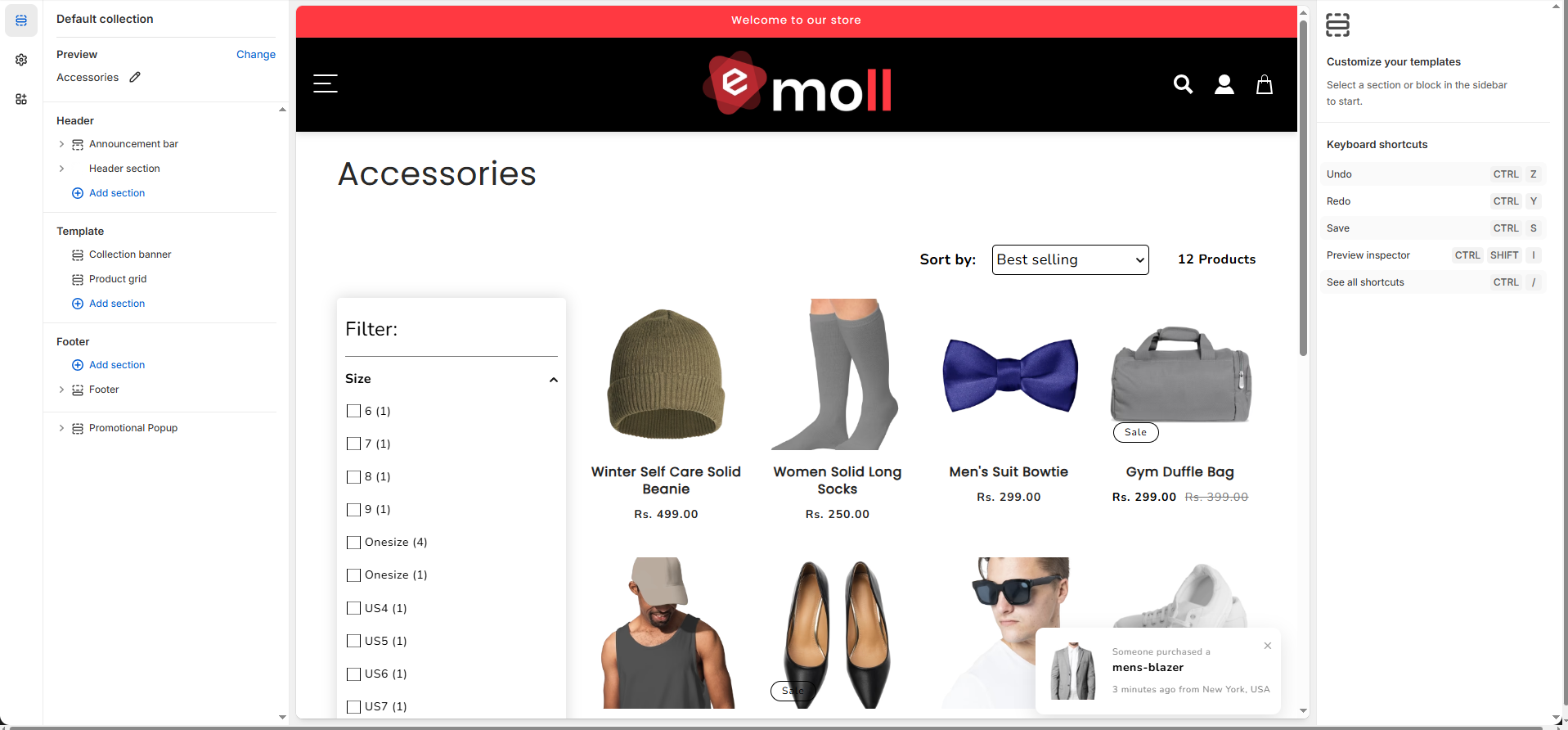
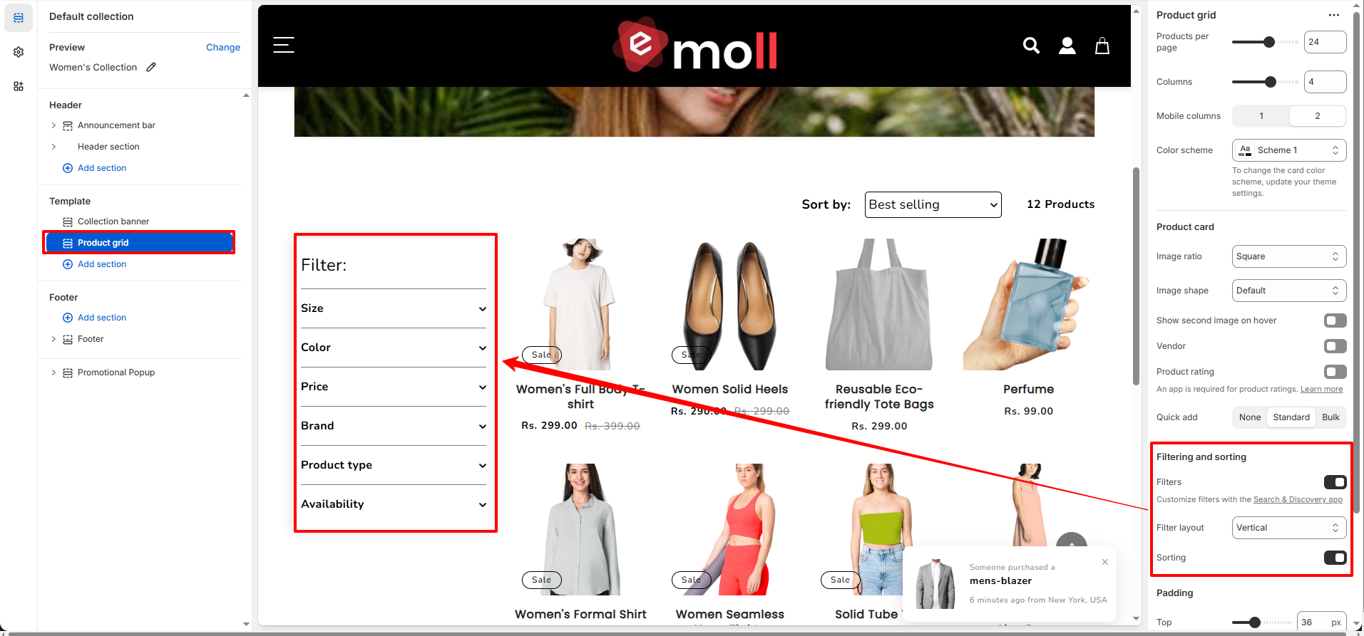
6. Filtering and Sorting
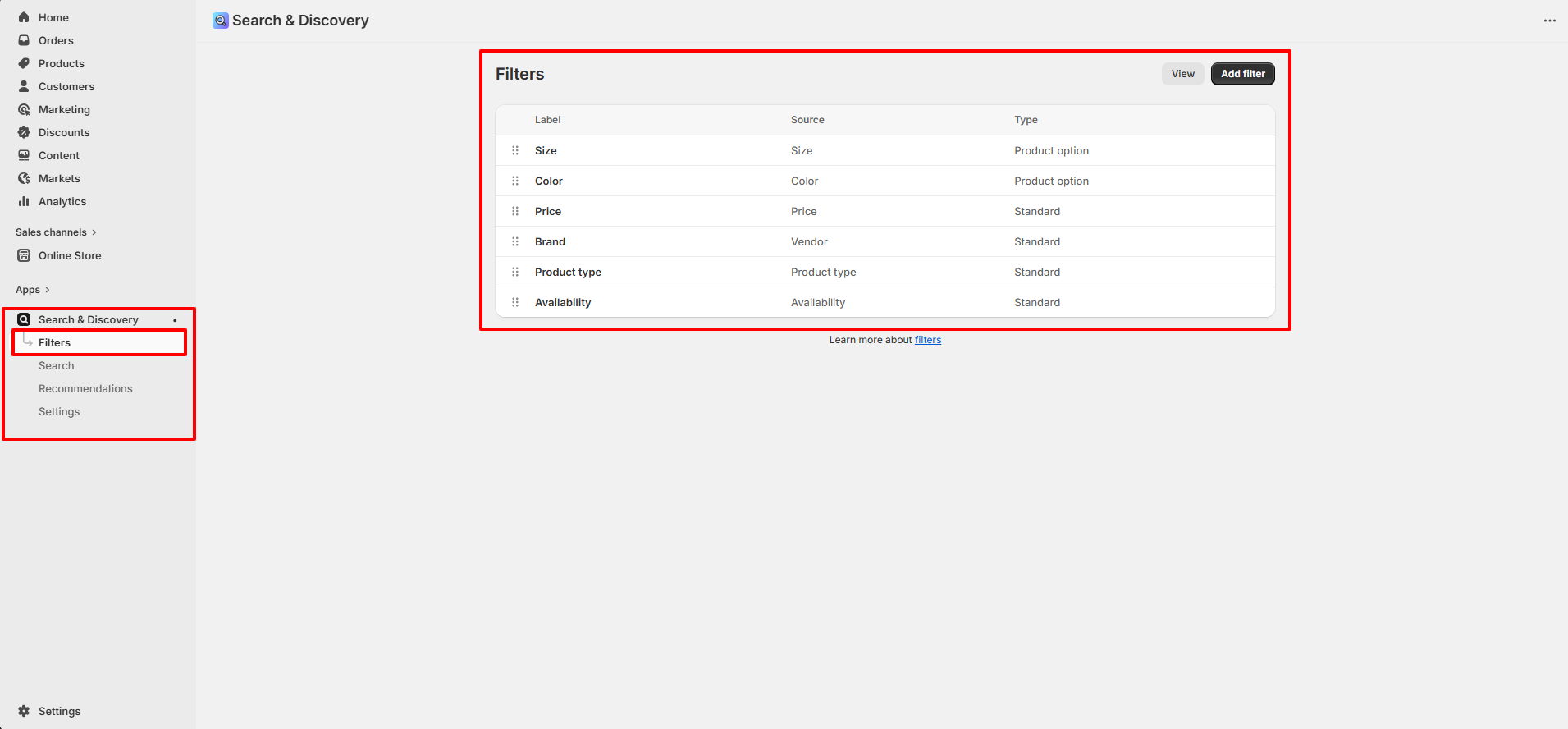
The Collection Page includes built-in filtering and sorting functionality to improve product discovery and user experience. Filters are managed using Shopify�s Search & Discovery app.
A. How to Add Filters (Search & Discovery App)
- Go to Shopify Admin.
- Navigate to Apps >> Search & Discovery.
- Click on Filters from the left sidebar.
- Click the Add filter button (top right).
- Select the filter source (e.g., Product option, Price, Vendor, Product type, Availability, or Metafields).
- Choose the specific option (e.g., Size, Color).
- Click Add and then Save.
Once saved, the selected filters will automatically appear on your Collection Page.
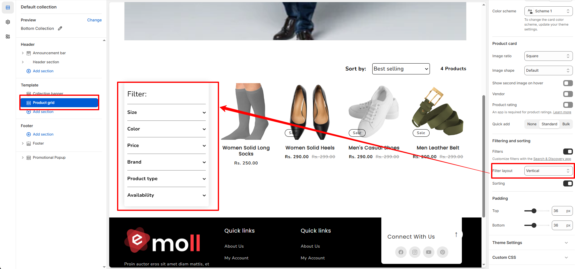
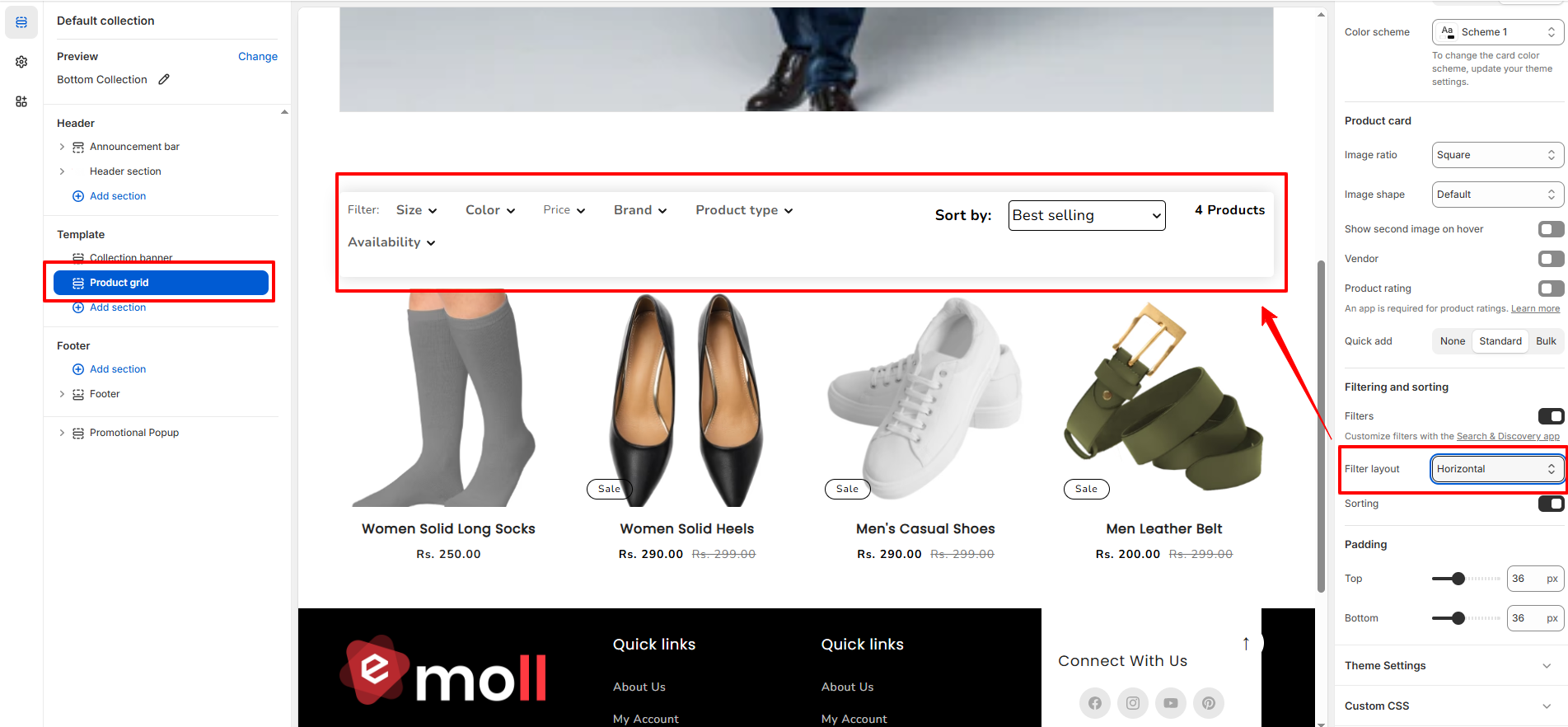
B. Filter Layout
-
Vertical: Displays filters in a left sidebar.
-
Horizontal: Displays filters in a top bar above the product grid.
-
Drawer: Displays filters inside a slide-out panel (recommended for mobile).
C. Common Filter Types
- Size (Product option)
- Color (Product option)
- Price
- Brand (Vendor)
- Product Type
- Availability
D. Sorting Options
- Featured
- Best Selling
- Alphabetically (A�Z / Z�A)
- Price (Low to High / High to Low)
- Date (Newest First / Oldest First)
8. Best Practices
- Use high-quality and consistent product images.
- Write SEO-friendly collection descriptions.
- Enable filtering to enhance user experience.
- Maintain consistent image ratios across products.
- Avoid overcrowding collections with unrelated products.