Product Page
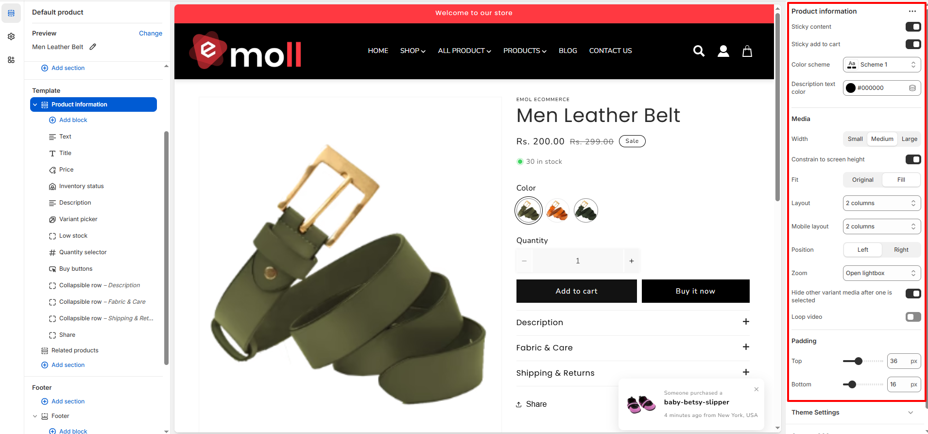
The Emoll product page offers flexible customization options for media layout, spacing, and color schemes, allowing you to create a visually engaging and conversion-focused product experience. It includes a wide range of configurable blocks within the Product Information section, such as the variant picker, product title, price, inventory status, quantity selector, add-to-cart buttons, collapsible content tabs, sharing options, related products, and more.
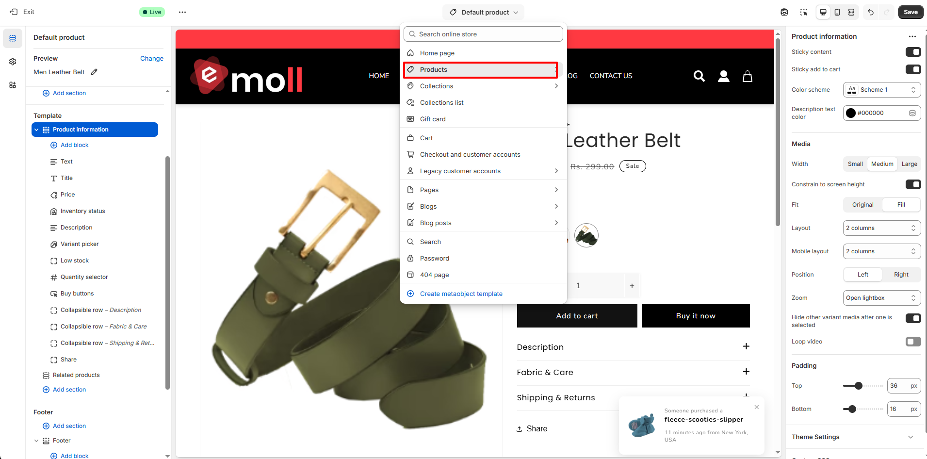
1. How to Access Product Page Settings
- Log in to your Shopify Admin Dashboard.
- Go to Online Store >> Themes.
- Click Customize on your active theme.
- From the top dropdown, select Products >> Default product.
- Click on the Product Information section.
2. Product Page Overview
The Product Page displays detailed information about a single product, including product media, pricing, variants, inventory status, description, and purchase options.
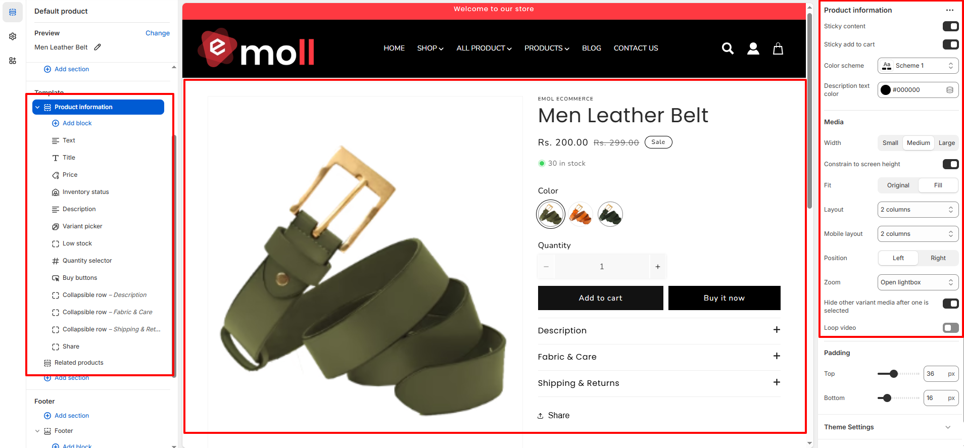
3. Configuration Settings
Inside the Product Information section, you can customize the following settings:
- Sticky Content: Keeps the product information section fixed while scrolling.
-
Sticky Add to Cart:
Keeps the Add to Cart button visible as customers scroll the page.
- Color Scheme: Select a color scheme to match your store branding.
- Description Text Color: Choose the text color for the product description area.
-
Media Width:
Control the product image size:
- Small
- Medium
- Large
- Constrain to Screen Height: Limits the product media height to fit within the screen.
-
Media Fit:
- Original: Displays the image in its original aspect ratio.
- Fill: Fills the container area.
- Layout: Choose the column layout (e.g., 2-column layout).
- Mobile Layout: Select how the product page appears on mobile devices.
-
Media Position:
- Left
- Right
- Zoom: Enable image zoom or open the media in a lightbox on click.
- Hide Other Variant Media: Displays only the selected variant�s media.
- Loop Video: Enables automatic looping for product videos.
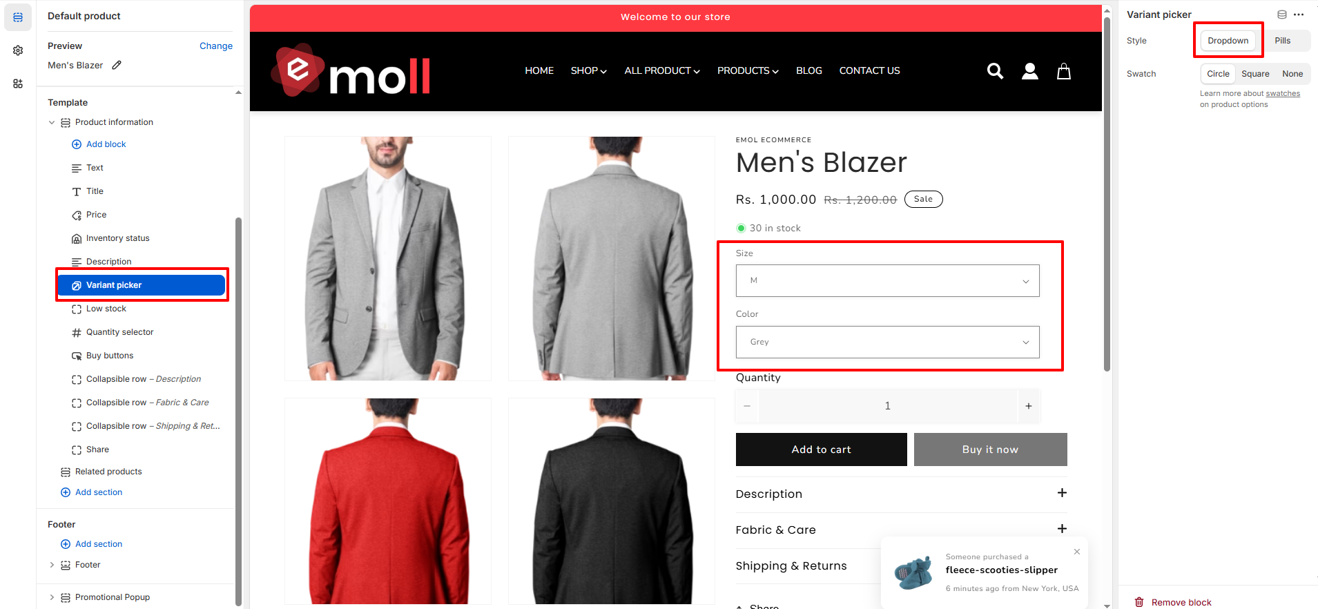
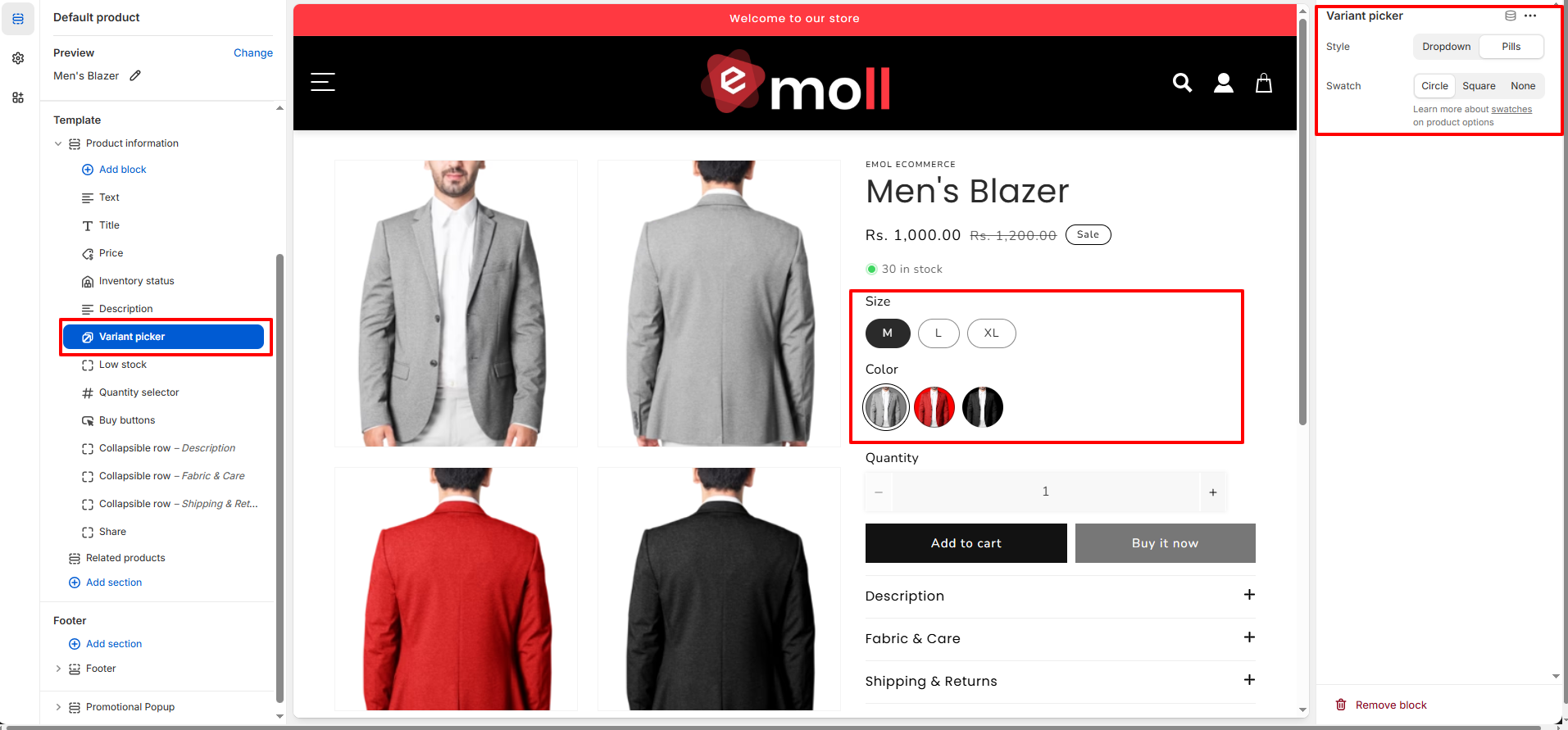
4. Variant Picker
The Variant Picker block allows customers to select product options such as size, color, or other variants. It offers flexible display styles to match your store design.
-
Style:
Choose how variant options are displayed:
-
Dropdown: Displays variants in a select dropdown menu.
-
Pills: Displays variants as clickable buttons.
-
Dropdown: Displays variants in a select dropdown menu.
-
Swatch Shape:
Select the shape for color swatches:
- Circle
- Square
- None
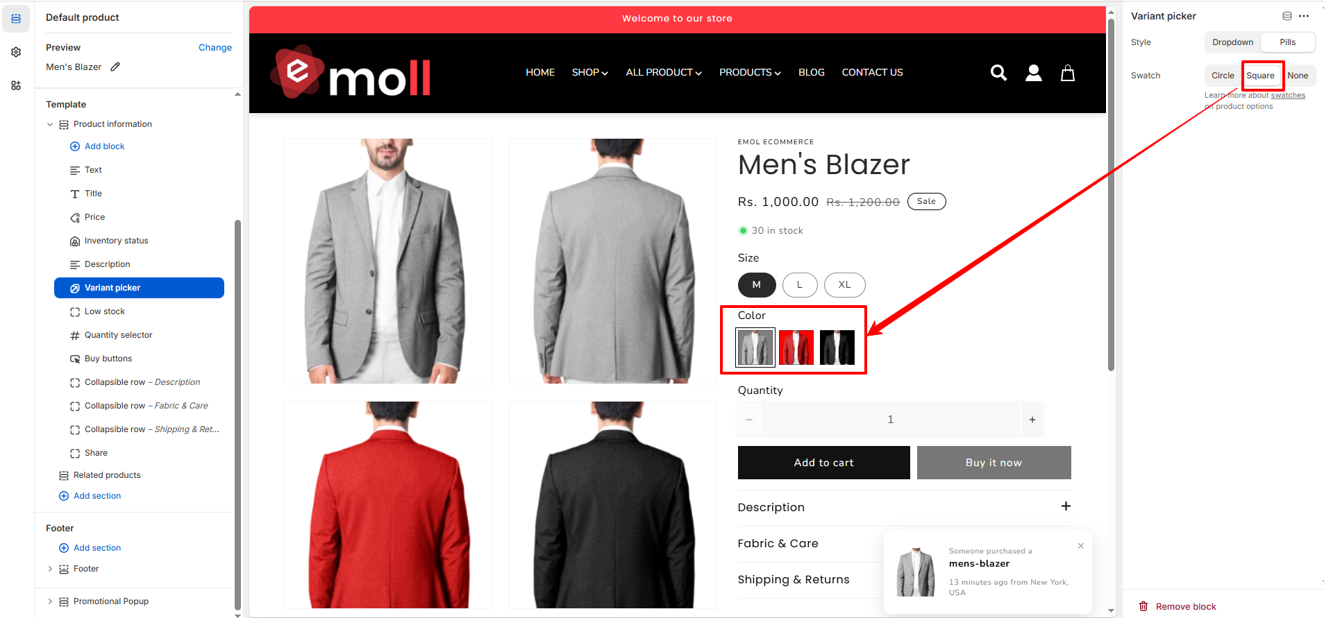
Note: Swatches are applied only to color variants.
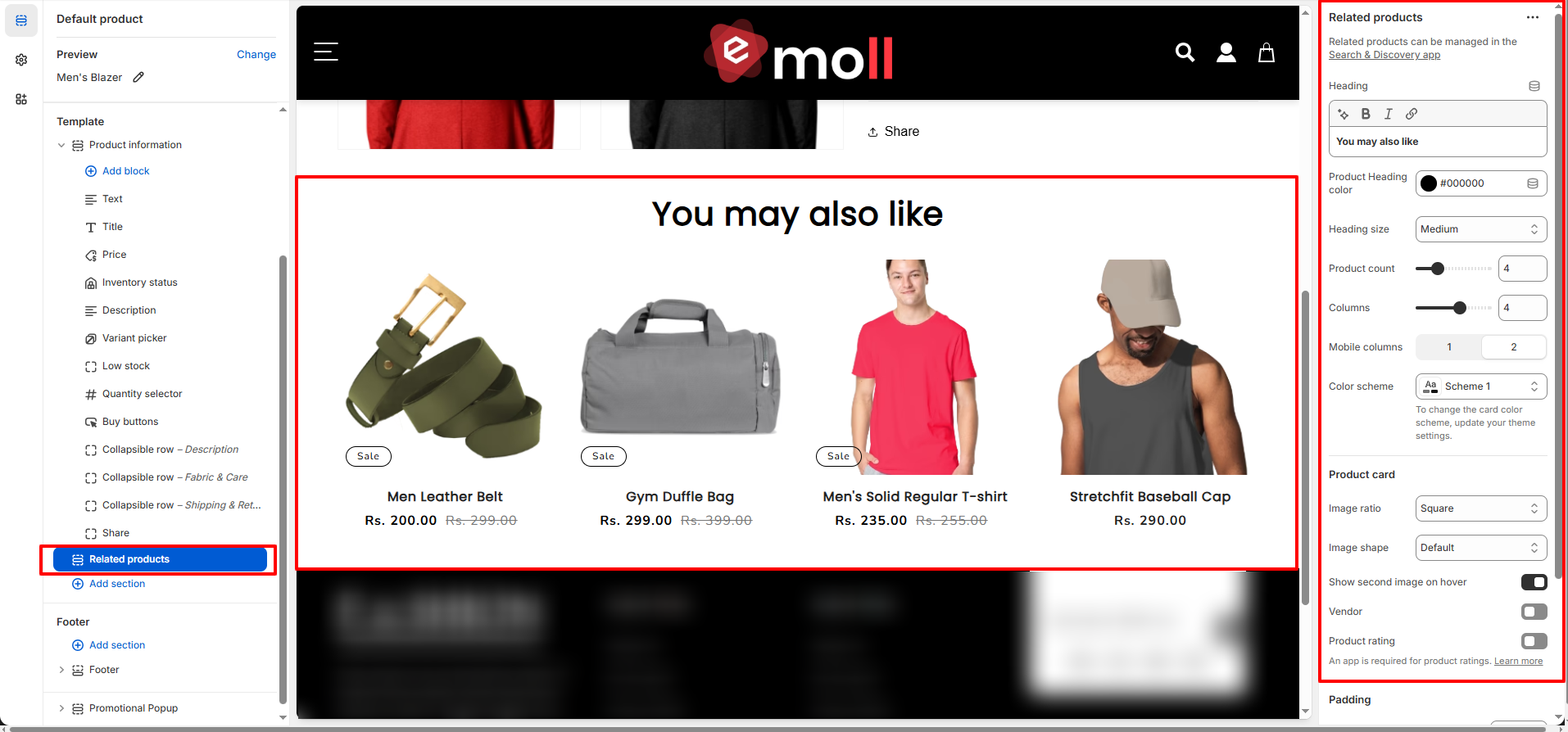
5. Related Products
The Related Products section displays recommended items below the product page to encourage additional purchases and improve product discovery. Related products can be managed using Shopify�s Search & Discovery app.
- Heading: Set a custom section heading (e.g., �You may also like�).
- Product Heading Color: Choose the text color for the section heading.
- Heading Size: Select the heading size (Small, Medium, Large).
- Product Count: Control how many related products are displayed.
- Columns: Select the number of columns displayed on desktop.
- Mobile Columns: Choose how many products appear per row on mobile devices.
- Color Scheme: Apply a color scheme to match your store branding.
Product Card Settings
- Image Ratio: Choose the image aspect ratio (e.g., Square).
- Image Shape: Select the image style (Default or other available styles).
- Show Second Image on Hover: Displays an alternate product image on hover.
- Vendor: Enable to display the product vendor name.
- Product Rating: Displays product ratings (requires a review app).