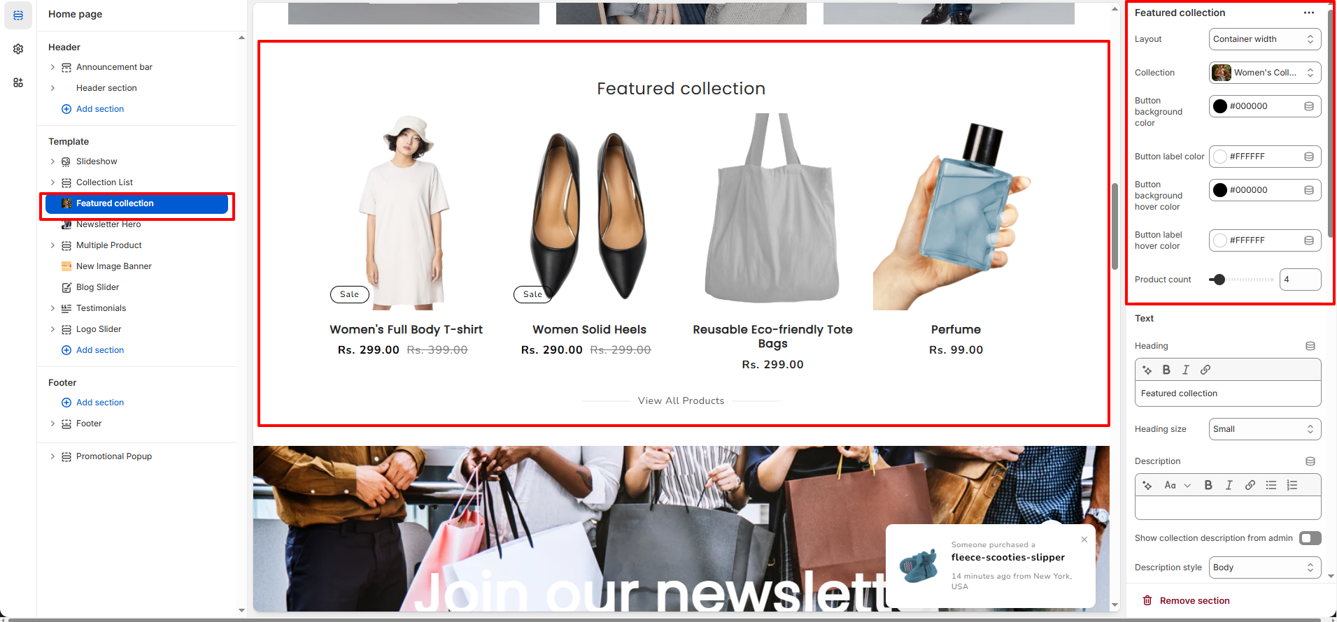
Featured Collection Section
The Featured Collection section allows you to showcase products from a selected collection in a customizable grid layout. It is commonly used on the homepage to highlight best-selling, new arrival, or seasonal products.
1. Featured Collection Section Settings
These settings apply to the entire Featured Collection section.
- Layout: Choose between container width or full-width layout.
- Collection: Select the collection whose products will be displayed.
- Product Count: Control how many products are shown in the section.
- Color Scheme: Apply a predefined color scheme for the section background and content.
- Padding (Top & Bottom): Adjust the spacing above and below the section.
- Custom CSS: Add custom styles for advanced design adjustments.
2. Text Settings
- Heading: Add a custom section heading.
- Heading Size: Select the size of the section heading.
- Description: Add supporting text below the heading.
- Show Collection Description from Admin: Automatically display the collection description from Shopify admin.
- Description Style: Choose the typography style for the description text.
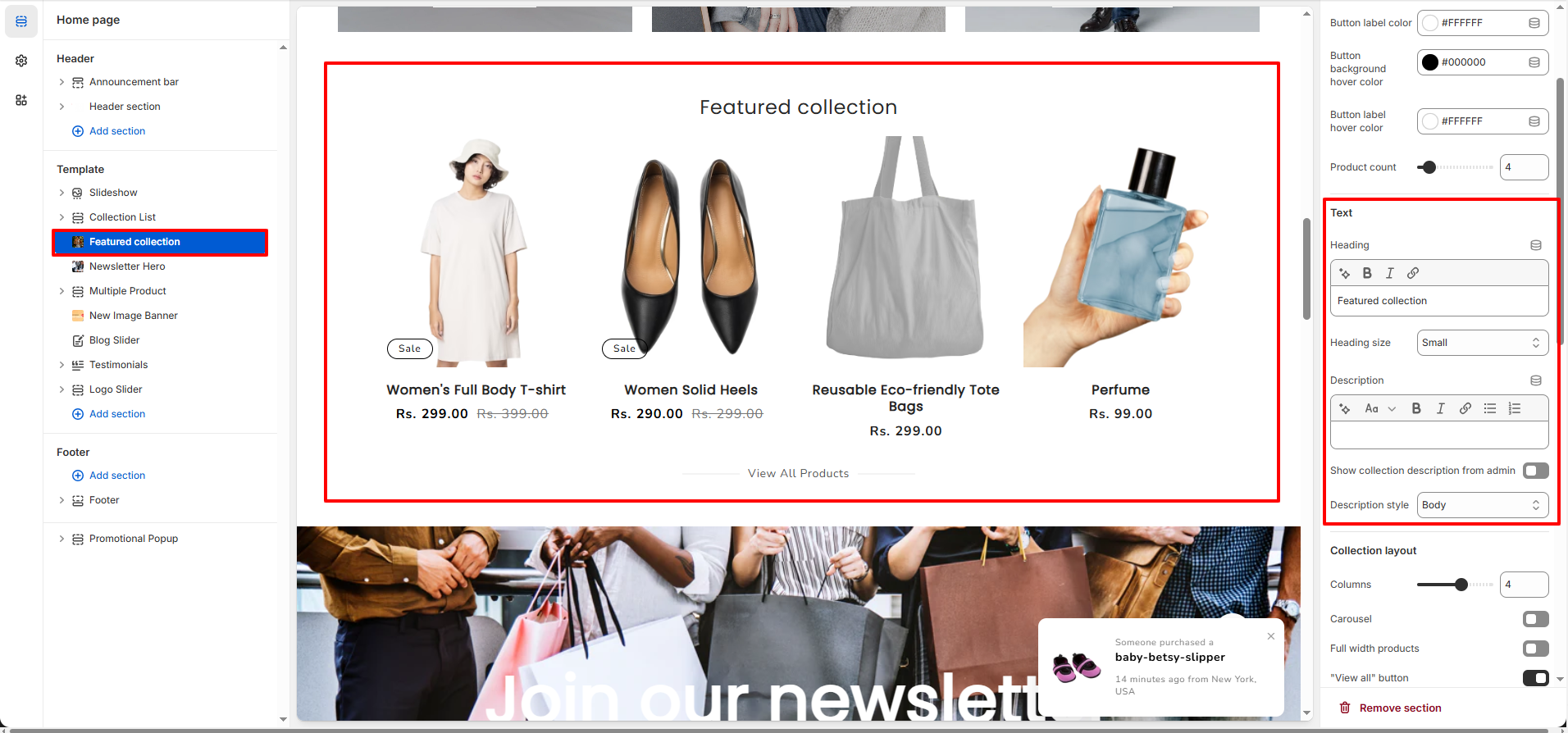
3. Collection Layout Settings
- Columns (Desktop): Control how many products appear per row on desktop.
- Carousel: Enable slider mode instead of grid layout.
- Full Width Products: Expand products to take full available width.
- "View All" Button: Display a button linking to the full collection page.
- "View All" Style: Choose between solid or outline button styles.
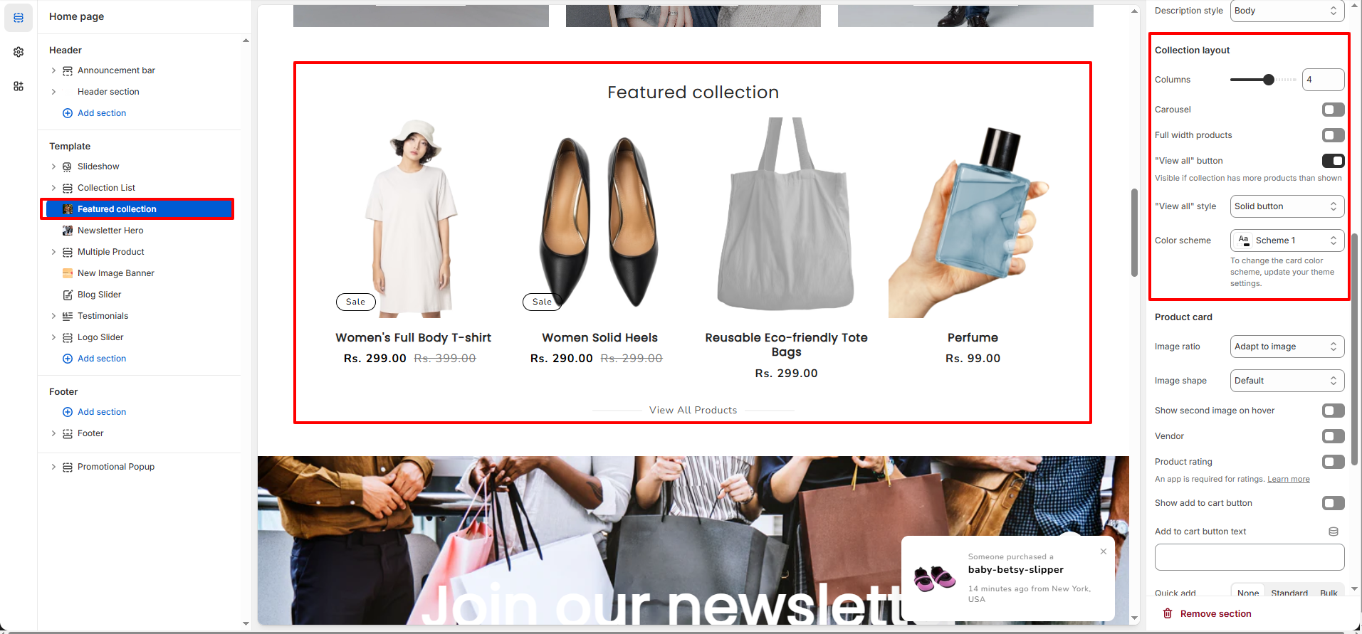
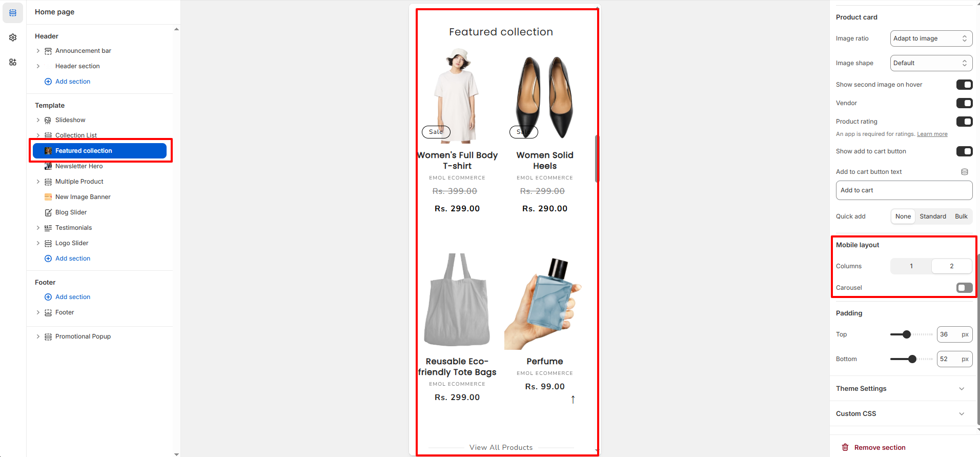
4. Product Card Settings
- Image Ratio: Control how product images are resized (Adapt to image, Square, Portrait, etc.).
- Image Shape: Choose the shape style for product images.
- Show Second Image on Hover: Display the second product image when hovering.
- Vendor: Show or hide the product vendor name.
- Product Rating: Enable product rating display (requires rating app).
- Show Add to Cart Button: Display add-to-cart button on product cards.
- Add to Cart Button Text: Customize the add-to-cart button label.
- Quick Add: Choose between None, Standard, or Bulk quick add styles.
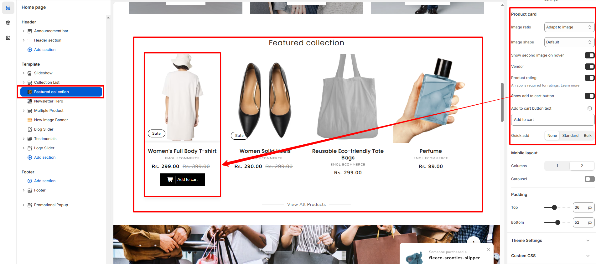
5. Mobile Layout Settings
- Columns (Mobile): Control how many products appear per row on mobile devices.
- Mobile Carousel: Enable slider layout for mobile view.
6. Best Practices
- Use high-quality product images for better presentation.
- Limit product count to maintain clean layout and fast performance.
- Use carousel only when displaying larger product sets.
- Enable "View All" button for better navigation.
- Keep heading short and action-focused (e.g., Best Sellers, New Arrivals).