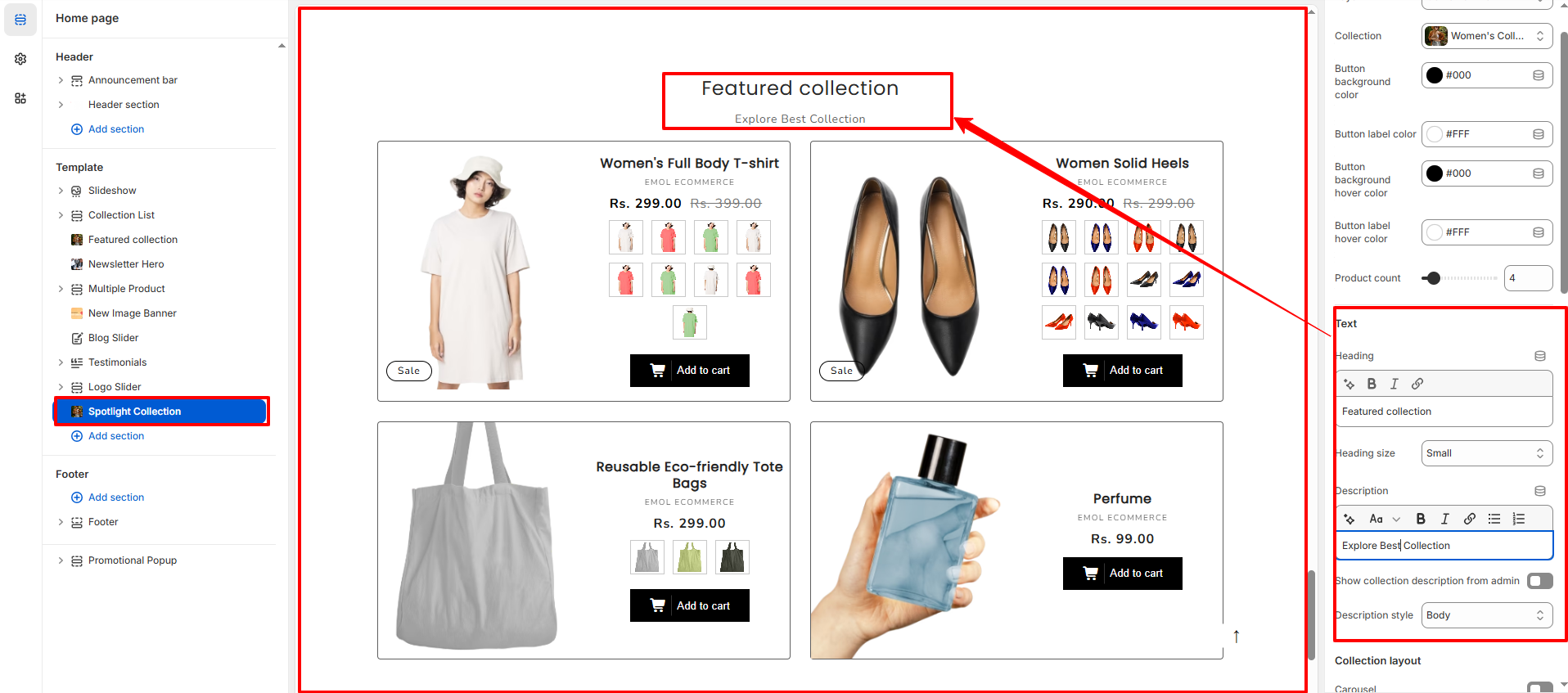
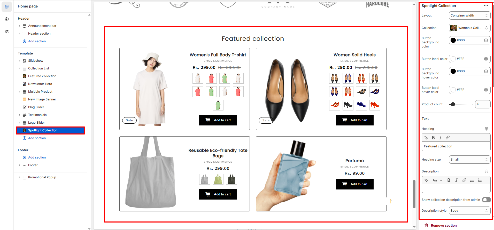
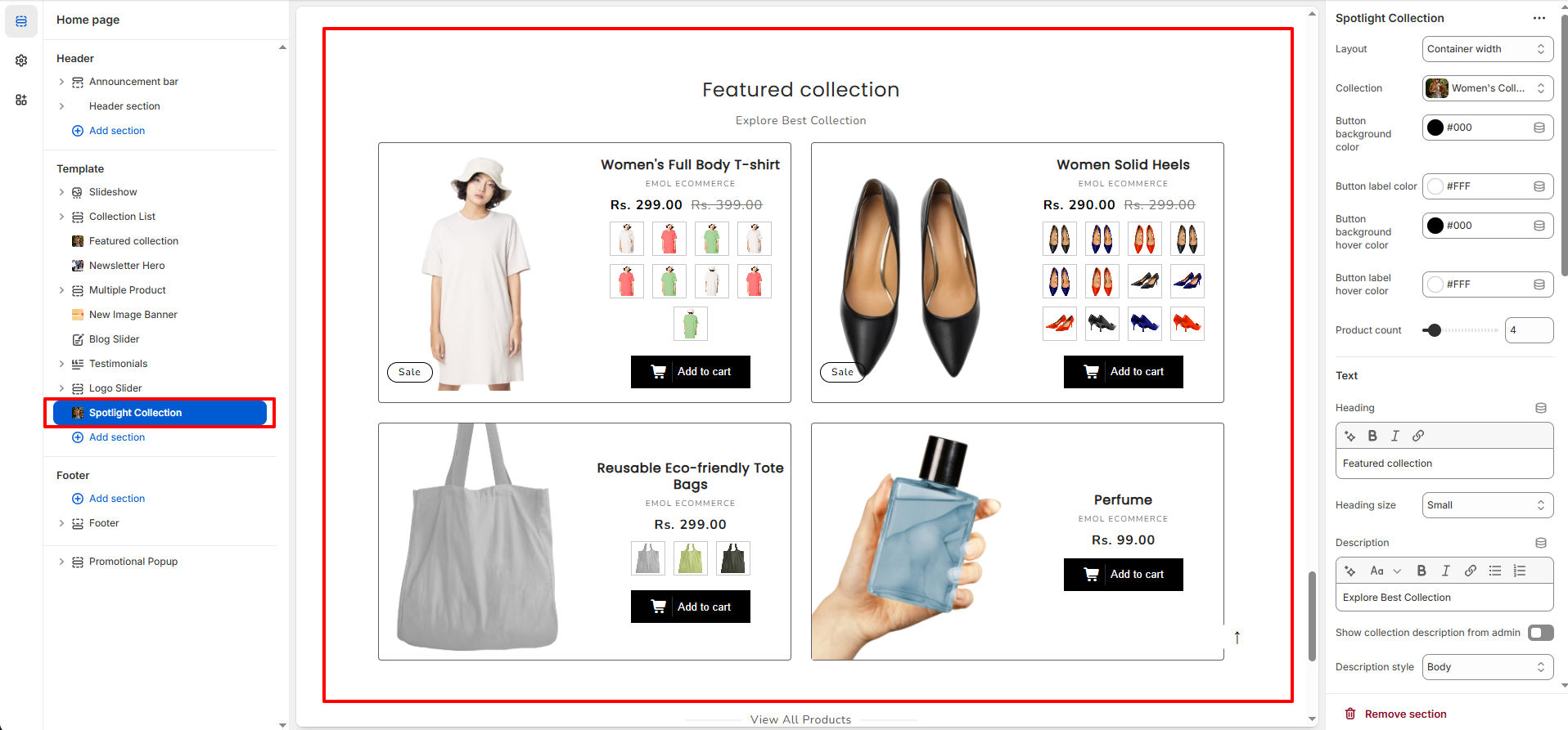
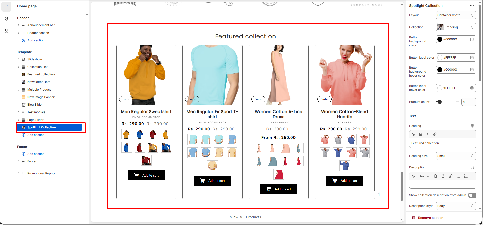
Spotlight Collection Section
The Spotlight Collection section allows you to feature a selected collection in a visually structured product grid layout. This section is ideal for highlighting featured collections, new arrivals, seasonal products, or promotional items directly on the homepage.
1. Spotlight Collection Section Settings
These settings apply to the entire Spotlight Collection section.
Layout Settings
- Layout: Choose between Container Width or Full Width layout for the section.
- Collection: Select the collection you want to display in this section.
- Product Count: Control the number of products displayed from the selected collection.
Button Settings
- Button Background Color: Set the background color of product buttons.
- Button Label Color: Adjust the text color of the button.
- Button Background Hover Color: Set the button background color on hover.
- Button Label Hover Color: Control the button text color on hover.
- Add to Cart Button Text: Customize the label text for the Add to Cart button.
- Show Add to Cart Button: Enable or disable the Add to Cart button display.
Text Settings
- Heading: Enter the section title (e.g., Featured Collection).
- Heading Size: Choose the size of the section heading.
- Description: Add optional descriptive text below the heading.
- Show Collection Description from Admin: Enable to display the collection description added in Shopify admin.
- Description Style: Select the text style for the collection description.
Collection Layout
- Carousel: Enable to display products in a slider format.
- Full Width Products: Allow products to stretch across the full available width.
- View All Button: Show or hide the �View All� collection button.
- View All Style: Choose the button style (e.g., Solid button).
- Color Scheme: Select the predefined theme color scheme for the section.
Product Card Settings
- Image Ratio: Control how product images are displayed (e.g., Adapt to Image).
- Image Shape: Choose the shape of the product image (Default, Rounded, etc.).
- Show Second Image on Hover: Display the second product image when hovering.
- Vendor: Show or hide the product vendor name.
- Product Rating: Enable product rating display (requires rating app integration).
- Enable Swatches: Show color or variant swatches on product cards.
-
Swatches Position:
Choose where swatches appear (Side of product image or Below the product Image).
-
Side Of Product Image
-
Below Of Product Image
-
Side Of Product Image
- Add Border: Enable or disable product card border.
- Quick Add: Select quick add style (None, Standard, Bulk).
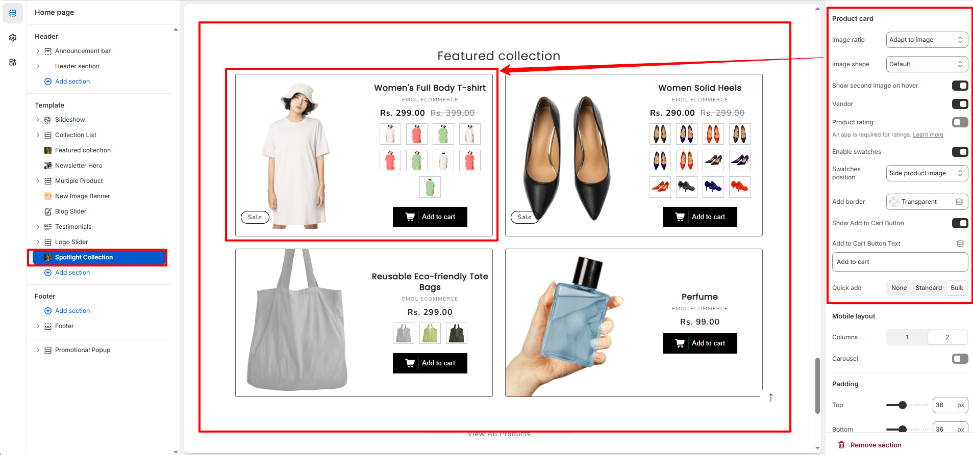
Mobile Layout
- Columns: Choose number of product columns for mobile devices.
- Carousel (Mobile): Enable slider layout for mobile view.
Section Spacing
- Top Spacing: Adjust the spacing above the section.
- Bottom Spacing: Adjust the spacing below the section.