Rich Text
The Rich Text section allows you to add flexible text content anywhere in your store. It is ideal for highlighting important messages, sharing brand stories, introducing collections, or displaying promotional information in a clean and structured layout.
You can customize headings, text alignment, buttons, and even apply gradient text styling. Any text wrapped inside [ ] brackets will automatically appear with the selected gradient color style, helping you highlight important words or phrases.
1. How to Add the Rich Text Section
- Log in to your Shopify Admin.
- Go to Online Store >> Themes.
- Click Customize on the Emoll-Apario theme.
- In the Theme Editor, navigate to the page where you want to add the section.
- Click Add Section.
- Select the Rich Text section from the list.
- Click Save to apply your changes.
2. Rich Text Section Settings
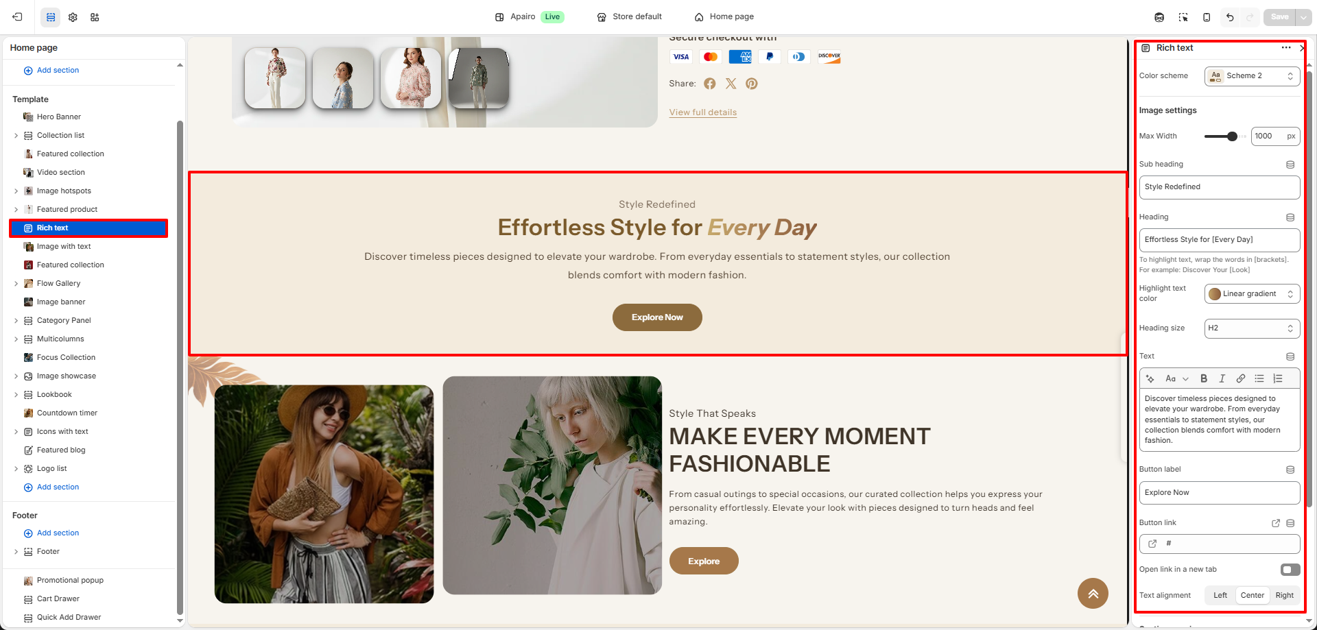
The Rich Text section includes several settings that allow you to control the layout, styling, and content displayed within the section.
-
Color Scheme:
Choose a predefined color scheme to control the background and text colors used in the section. -
Image Max Width:
Adjust the maximum width of the image displayed in the section. Increasing the value will make the image appear larger and more visually prominent. -
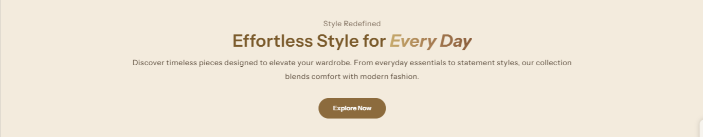
Subheading:
Add a short line of text above the main heading to introduce or highlight the content of the section. -
Heading:
Enter the main title that will appear prominently in the section. -
Gradient Color:
Select a gradient color style that can be applied to text. Any text placed inside [ ] brackets will automatically display using the selected gradient color.
Example:
Discover our new [Summer Collection] -
Heading Size:
- H1: Largest heading style used for strong visual emphasis.
- H2 / H3: Slightly smaller heading styles suitable for compact layouts.
-
Text:
Add detailed content such as brand descriptions, announcements, promotional messages, or featured information. -
Button Label:
Enter the text that will appear on the button (for example: Shop Now or Explore Collection). -
Button Link:
Select the page, collection, or product that should open when the button is clicked. -
Text Alignment:
- Left: Aligns the text to the left side of the section.
- Center: Centers the text for a balanced layout.
- Right: Aligns the content to the right side for a modern layout.